-
Notifications
You must be signed in to change notification settings - Fork 31
Ideas Benjamin
Hi, I'm Benjamin. These are my ideas for the MooTools website redesign. You can contact me at [email protected].
MooTools has been around for quite a while and has a mature code base. However, since the frequency and number of releases has slowed, blog posts are infrequent, and the core developers are working on newer projects, the perception of some parts of the community has been that MooTools is slowly dying.
Meanwhile, jQuery adoption has soared for a number of reasons: it's actively developed, it's easy to get started, has a high number of plugins, corporate sponsorship, and a large community. While MooTools has a fundamentally different philosophy than jQuery in terms of programming philosophy, many of jQuery's "soft skills" in community building and ease of use can be admired and even emulated.
With all of that in mind, it seems that a website redesign for MooTools.net is something that would be beneficial to both the project and the community at large.
- Make it easier for new users to figure out what to do and get started.
- Maintain the same general structure for existing MooTools users in order to minimize friction because of the transition.
- Place a bigger emphasis on community.
- Make the site responsive and accessible for mobile devices.
- Introduce the newer projects in the MooTools ecosystem: Prime, Elements, Slick, MooFx, Agent, and WrapUp.
- Make it easier for the MooTools projects to be shared and found online.
- Microsites for each MooTools project. All sites will share the same general navigation and design, with slight variations for each project. It should be easy to navigate from one to another.
- Clear descriptions of what each project is, what it does, and how it works together with other projects.
- Expanded demos and tutorials for each class and method. Use jsFiddle in the docs and give better real world uses across the board. We should write the docs or at least some beginner tutorials assuming the reader has no object-oriented experience.
- An emphasis on SEO: each page should have the proper titles and descriptions. Micro data should be used wherever is appropriate. Descriptive anchor text should be used at all times. No broken links, missing content, or funny redirects.
- Social sharing widgets should be included on all appropriate pages including blog posts and plugin pages. All RSS feeds of blog posts or new plugins should automatically be fed through the various social media accounts.
- Use a responsive framework. I would like to volunteer my framework, VM UI Framework, as it is MooTools based.
- Keep the forge. It's an important part of the community and shouldn't be abandoned. Rename it to plugins, expand it to include plugins using the new MooTools projects. Make plugins more discoverable by displaying more of them at a time.
- Each page should be looked at critically. What is its primary goal? Secondary goal? What needs to be added, what can be subtracted? Ease of use and consistency should be primary concerns throughout the project.
- A community directory that lists resources in the form of extra frameworks and tutorials, as well as a site or script showcase.
- Developer profiles. Allow developers to register and have a profile page with their contributions to the community: plugins and tutorials. This could simply be an expansion of the current forge.
- Frontpage - Defaults to MooTools.
- /about - Explains the difference between the different projects.
- /blog/ - One blog for all projects.
- /community/ - The community resource center, with links to compatible projects, tutorials, books, and a site showcase.
- /developers - Provides bios and contact info for the dev team.
- /plugins/ - The plugins directory.
- /mootools/ - Would redirect to the front page
- /mootools/docs - The MooTools docs overview page
- /mootools/docs/core/ - The core overview page
- /mootools/docs/more/ - The more overview page
- /mootools/demos/ - Demos for MooTools
- /mootools/download - The download builder for MooTools
- /prime/ - The prime landing page
- /prime/docs/ - docs for prime
- /prime/demos - demos for prime
- /prime/download - download page for prime
- /elements/ - The elements landing page
- /elements/docs/ - docs for elements
- /elements/demos - demos for elements
- /elements/download - download page for elements
- /moofx/ - The moofx landing page
- /moofx/docs/ - docs for moofx
- /moofx/demos - demos for moofx
- /moofx/download - download page for moofx
- /slick/ - The slick landing page
- /slick/docs/ - docs for slick
- /slick/demos - demos for slick
- /slick/download - download page for slick
- /agent/ - The agent landing page
- /agent/docs/ - docs for agent
- /agent/demos - demos for agent
- /agent/download - download page for agent
- /wrapup/ - The WrapUp landing page
- /wrapup/build - Allows users to use WrapUp
In order to better facilitate community growth, the target audience for all tutorials and documentation should be for beginner-level JavaScript developers. Assume no object-oriented, command line, or Node.js experience. This isn't to say that the docs and tutorials can't target experienced developers, just take a little extra time to get everyone up to speed, or, at the very least link to resources that do so. The goal is to reduce the learning curve through education, not by changing the API or coding philosophy.
Writing tone should be friendly and helpful. Try to choose real world use cases for all example code.
Each microsite should be distinct, but should fit in with the overall site scheme. I've expanded on the ideas put forth by Pietro and Rasmus and color coded each MooTools project, creating logos that are similar but unique. All images can be found at (https://github.com/VirtuosiMedia/MooTools-Website-Mockups).
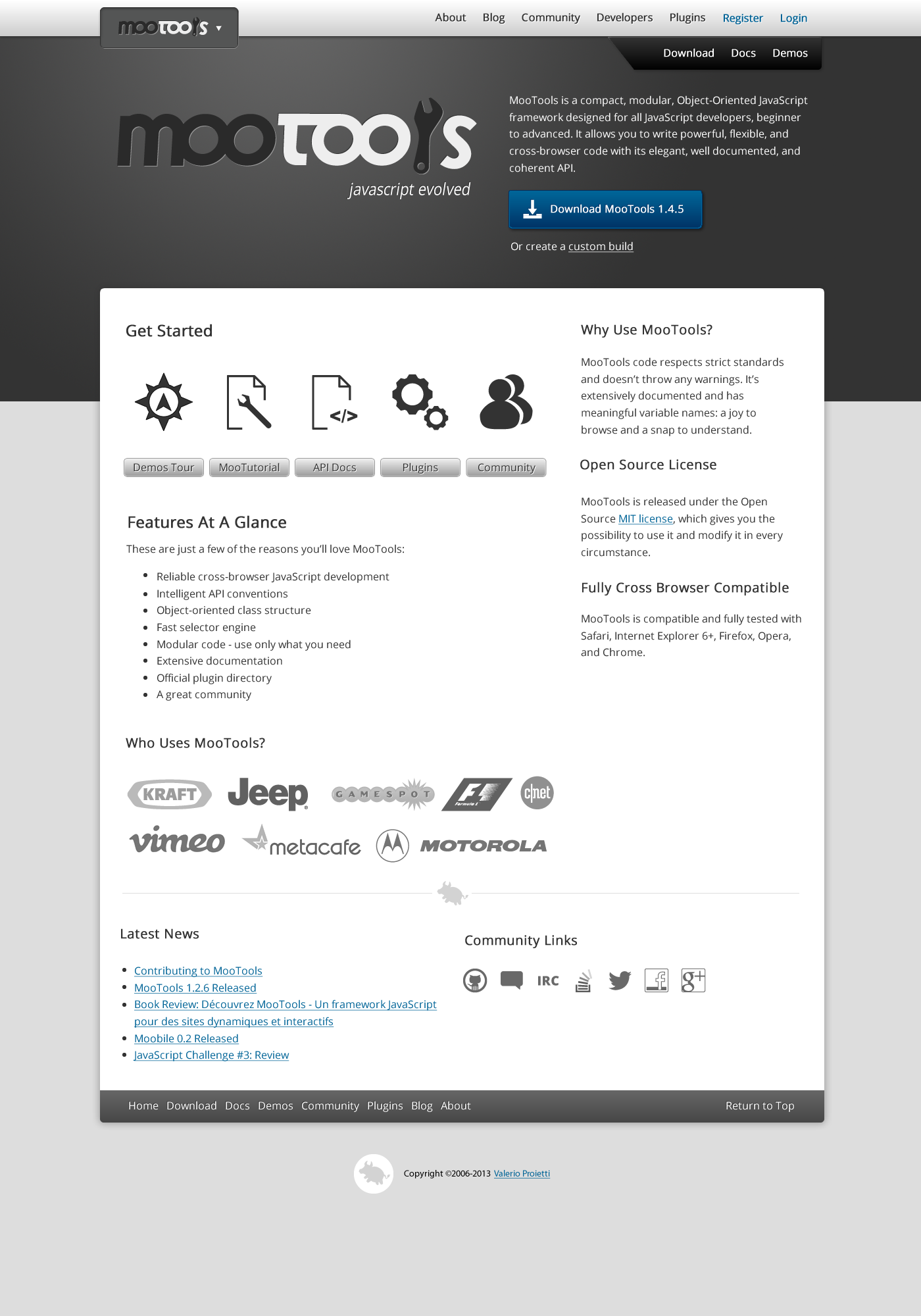
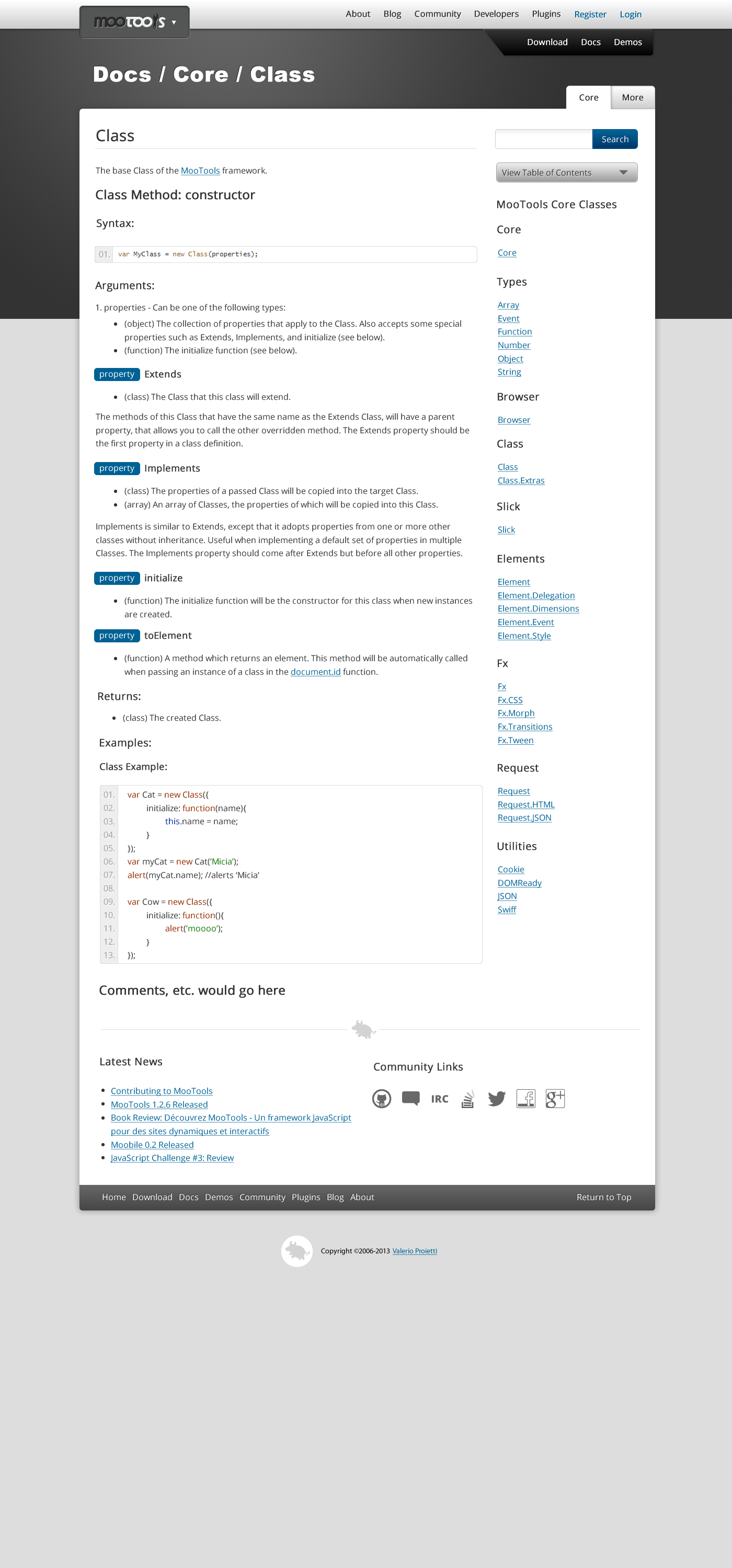
Below are the mockups of the site based on the requirements above and feedback given through the Google Group. Full-size images can be viewed at (https://github.com/VirtuosiMedia/MooTools-Website-Mockups). Note that these are only a few of the pages that would be necessary for the site. They are meant to convey the general look and feel of how the site would look as a whole.
One more note: The upper left logo in the header of each mockup would be a dropdown menu allowing you to easily navigate between MooTools, Prime, Elements, and the rest of the new microsites.


