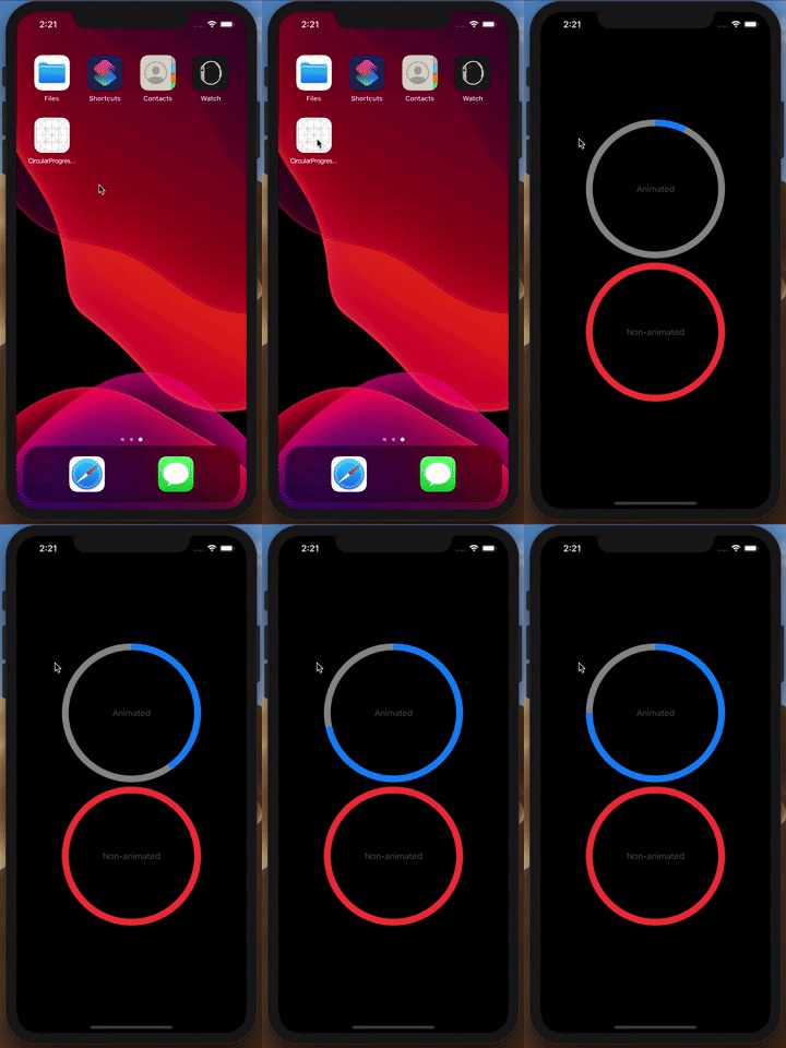
Circular and animated progress bar for iOS. It has configurable properties of bars, text and colors. Included animation for filling up the track.
Size of the bar (stroke width) - default value is CGFloat(12.0)
// Change stroke to 18
bar.lineWidth = CGFloat(18.0)Text to be displayed in the middle - default value is nil
// Set the text inside progress view
bar.text = "Calories intake"Attributed text to be displayed in the middle - default value is nil
// Set the attributed text inside progress view
bar.attributedText = "Calories intake"Color for text inside progress bar when no attributedText is used - default value is UIColor.darkGray
// Set the color for text inside progress view
bar.textColor = .systemRedFont size for text inside progress bar - default value is CGFloat(16.0)
// Set the font size of text inside progress view
bar.textSize = CGFloat(20)Color for background (base) track - default value is UIColor.systemGray
// Set the background color of track
bar.backgroundBarColor = .whiteColor for foreground (main) track - default value is UIColor.systemBlue
// Set the foreground color of track
bar.foregroundBarColor = .yellowColor for the foreground (main) track when it reaches the maximum value (full circle) - default value is UIColor.systemRed
// Set the color of track when full circle is drawn
bar.maximumBarColor = .orangeDuration of the "filling" animation - default value is TimeInterval(1.0)
// Make the animations slow like in the demo bellow
bar.animationDuration = TimeInterval(3.0) /// Set the visual impression of progress on this UIView
///
/// - Parameters:
/// - progress: normalized value from range [0,1] however upper bound will be clamped
/// - animated: Switch animations on/off
public func setProgress(to progress: Double, animated: Bool)Difference between animation set to True and False - Example:


