-
Notifications
You must be signed in to change notification settings - Fork 16
BlogPost
We are excited to introduce React Spectrum Charts, an intuitive charting library that empowers you to build impactful data visualizations.

-
Intuitive: Developer experience comes first in the API design. The declarative API removes the need to understand advanced data visualization concepts. The code reads just like you would explain the chart to someone else.
-
Configurable: The component-based building blocks enable you to build the chart that solves your use case. The modular design makes it easy to compose complex visualizations with simple, easy to understand code.
-
Rational: By leveraging Spectrum (Adobe's Spectrum design system) you get beautiful charts backed by research, user testing, and industry best practices.
-
International: Support for 30+ date/number locales so that your users can view their data in the format that they would expect.
Data visualizations are a versatile tool that empower us to digest data in a way that nothing else can. Well-executed data visualizations can enhance the experience and engagement of your app by helping your users connect with the data and draw actionable insights. Unfortunately, implementing an effective visualization in web development is far from trivial.
The most prolific charting library in web is D3.js created by Mike Bostock. It is an incredibly powerful library but, it is also low-level. Working with D3.js requires you to have some understanding of the grammar of graphics. D3.js is also unopinionated and open ended so implementing an effective chart requires you to understand charting best practices.
There are many higher-level libraries (most of which are powered by D3.js) that abstract out some of the complexities mentioned above. Some of the popular ones are Chart.js, Highcharts, Recharts and Vega. These are great libraries that simplify the chart building process.
At Adobe, we found Vega to be a good balance of abstraction and control. However, developing a production-ready visualization typically required 1000+ lines of code. These visualizations were also not portable and still required the developer to understand the grammar of graphics and visualization best practices. No one on the team wanted to touch the visualization code after it was released.
To solve these challenges, we built React Spectrum Charts.
The primary focus of React Spectrum Charts is a clean and simple, declarative API. Complex visualization concepts and terms have been abstracted out.
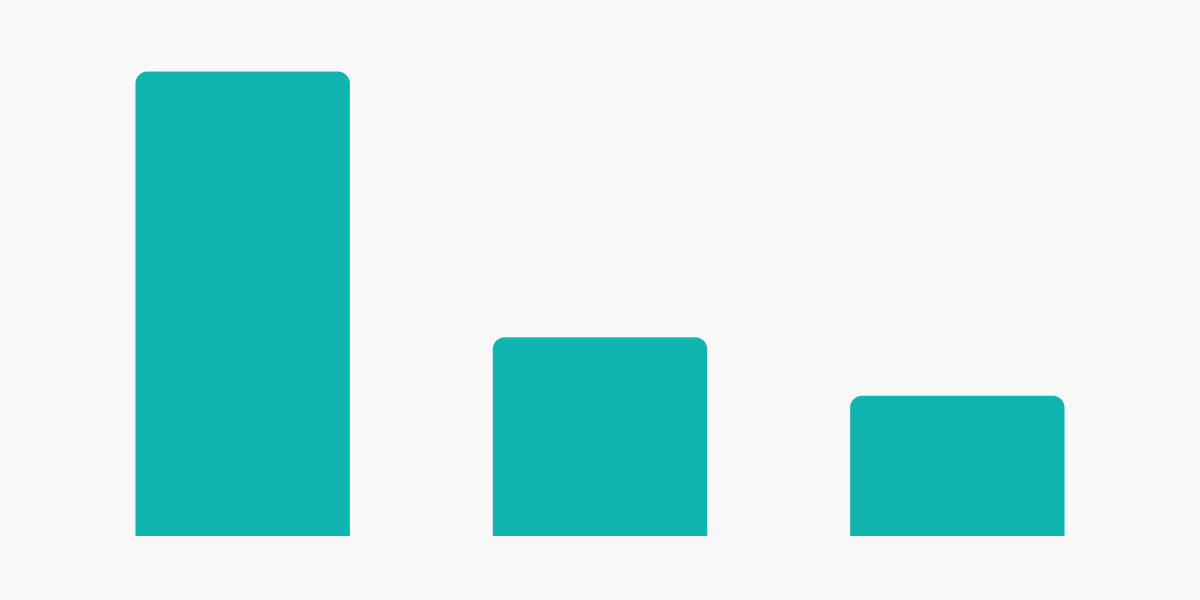
The API reads like how you would explain the chart to someone. For example, let’s say that you would like a Bar Chart that plots the number of users (users in your data) by operating system (operatingSystem in your data). The code for this in React Spectrum Charts would be as follows:
<Chart data={data}>
    <Bar dimension="users" metric="operatingSystem" />
</Chart>

This is a great start but let's say you would also like x and y axes on the chart. Simply add a couple and axis components:
<Chart data={data}>
    <Axis position="left" title="Users" />
    <Axis position="bottom" title="Operating System" />
    <Bar dimension="users" metric="operatingSystem" />
</Chart>

In the above example, there was no need to setup scales, calculate bandwidths or position text. All of that is handled by the library so that you don't have to. This does not mean that you have lost all control or that the library can only handle simple visualizations. Adobe Product Analytics uses React Spectrum Charts for all of its visualizations, many of which are highly advanced (check out the examples section of our storybook).
We think through every aspect of the API to give you just the right amount of control you need while not requiring you to configure things you shouldn't have to worry about.
A well-executed data visualization looks deceptively simple. Decades of research across the data visualization community have gone into figuring out the most effective ways to tell stories with data using visualizations. React Spectrum Charts is built on the foundation of this research and best practices thanks to the Spectrum design system. This means you can use the library with confidence that you are delivering an optimal data visualization experience to your users.
We started out by building the most common chart types and fundamental chart building blocks. Some examples are:
- Area
- Bar
- Donut (Pie)
- Line
- Scatter
- Annotation
- Axis
- Legend
- Popover
- Title
- Tooltip
- Trendline
For the full list of supported components, check out our documentation.
We are just getting started – stay tuned for upcoming components and features!
React Spectrum Charts is open source and ready for you to use! You can use our codesandbox template to try out the library now. Check out our documentation and our storybook to learn more.
We are excited to see what you build with React Spectrum Charts!
- React Spectrum Charts Github – https://github.com/adobe/react-spectrum-charts
- React Spectrum Charts Documentation – https://github.com/adobe/react-spectrum-charts/wiki
- React Spectrum Charts Storybook – https://opensource.adobe.com/react-spectrum-charts
- React Spectrum Charts Codesandbox Template – https://codesandbox.io/p/sandbox/ts-react-spectrum-charts-dgrd62
- Spectrum Design Website - https://spectrum.adobe.com/
@adobe/react-spectrum-charts - Adobe 2024
Chart Components
Supplemental Chart Components
Layout Components