Please add alt text (alternative text) to all of your posted graphics for #TidyTuesday.
Twitter provides guidelines for how to add alt text to your images.
The DataViz Society/Nightingale by way of Amy Cesal has an article on writing good alt text for plots/graphs.
Here’s a simple formula for writing alt text for data visualization:
It’s helpful for people with partial sight to know what chart type it is and gives context for understanding the rest of the visual. Example: Line graph
What data is included in the chart? The x and y axis labels may help you figure this out. Example: number of bananas sold per day in the last year
Think about why you’re including this visual. What does it show that’s meaningful. There should be a point to every visual and you should tell people what to look for. Example: the winter months have more banana sales
Don’t include this in your alt text, but it should be included somewhere in the surrounding text. People should be able to click on a link to view the source data or dig further into the visual. This provides transparency about your source and lets people explore the data. Example: Data from the USDA
Penn State has an article on writing alt text descriptions for charts and tables.
Charts, graphs and maps use visuals to convey complex images to users. But since they are images, these media provide serious accessibility issues to colorblind users and users of screen readers. See the examples on this page for details on how to make charts more accessible.
The {rtweet} package includes the ability to post tweets with alt text programatically.
Need a reminder? There are extensions that force you to remember to add Alt Text to Tweets with media.
The data this week comes from the U.S. Drought Monitor. Many more datasets including county-level data can be accessed there. In the interest of size we stuck with state-level data.
This dataset was covered by the NY Times and CNN.
The dataset for today ranges from 2001 to 2021, but again more data is available at the Drought Monitor.
Drought classification can be found on the US Drought Monitor site.
Please reference the data as seen below:
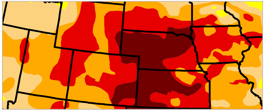
The U.S. Drought Monitor is jointly produced by the National Drought Mitigation Center at the University of Nebraska-Lincoln, the United States Department of Agriculture, and the National Oceanic and Atmospheric Administration. Map courtesy of NDMC.
Some maps and other interesting summaries can be found on the Drought Monitor site and their Map Collection.
Some limitations of the data expanded on the Drought Monitor site.
# Get the Data

# Read in with tidytuesdayR package
# Install from CRAN via: install.packages("tidytuesdayR")
# This loads the readme and all the datasets for the week of interest

# Either ISO-8601 date or year/week works!

tuesdata <- tidytuesdayR::tt_load('2021-07-20')
tuesdata <- tidytuesdayR::tt_load(2021, week = 30)

drought <- tuesdata$drought

# Or read in the data manually

drought <- readr::read_csv('https://raw.githubusercontent.com/rfordatascience/tidytuesday/master/data/2021/2021-07-20/drought.csv')
| variable | class | description |
|---|---|---|
| map_date | double | Date map released |
| state_abb | character | State Abbreviation |
| valid_start | double | Start of weekly data |
| valid_end | double | End of weekly data |
| stat_fmt | double | Statistic format (2 for "categorical", 1 for "cumulative"") |
| drought_lvl | character | Drought level (None, DO, D1, D2, D3, D4) which corresponds to no drought, abnormally dry, moderate drought, severe drought, extreme drought or exceptional drought. |
| area_pct | double | Percent of state currently in that drought category |
| area_total | double | Total land area (sq miles) of state currently in that drought category |
| pop_pct | double | Population percent of total state population in that drought category |
| pop_total | double | Population total of that state in that drought category |
A note on "cumulative" data. For pop_pct, pop_total, area_pct, and area_total fields, this means that when drought_lvl == "D0", the value on the field is the sum of the drought levels D0 through D4 (but not including None). If you use the cumulative data and are looking to use actual per-level values, you will want to subtract each drought level from the next higher: D0 from D1, D1 from D2, and so on.
library(tidyverse)

read_and_prep <- function(file, type){
  read_csv(paste0("2021/2021-07-20/", file)) %>%
    pivot_longer(cols = None:D4, names_to = "drought_lvl", values_to = type) %>%
    janitor::clean_names()

}

state_area_pct <- read_and_prep("drought_area_pct.csv", "area_pct")
state_area <- read_and_prep("drought_area_total.csv", "area_total")
state_pct_pop <- read_and_prep("drought_pop_pct.csv", "pop_pct")
state_pop <- read_and_prep("drought_pop_total.csv", "pop_total")

all_df <- state_area_pct %>%
  left_join(state_area) %>%
  left_join(state_pct_pop) %>%
  left_join(state_pop) %>%
  rename(state_abb = state_abbreviation, stat_fmt = statistic_format_id)

all_df %>%
  write_csv("2021/2021-07-20/drought.csv")
